Engagement Starter Implementation
The discovery of community activity by new users is an important factor in growing your engaged audience. One of the tools Viafoura provides that helps with this objective is the Engagement Starter. Using the Engagement Starter higher in the article allows users to know there is engagement activity on the page.
Additionally, depending on your commercial terms with Viafoura, this product can be used to generate incremental advertisement revenue.
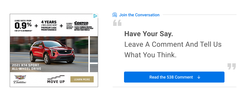
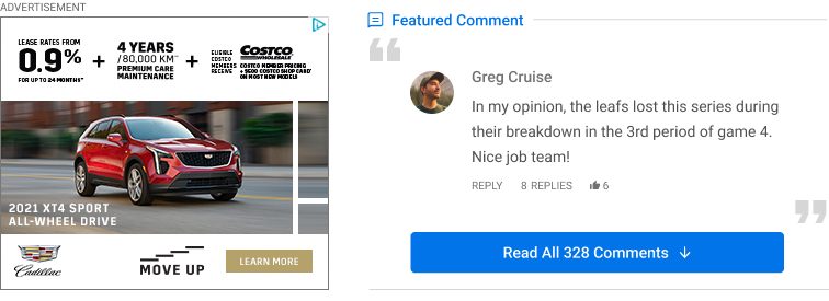
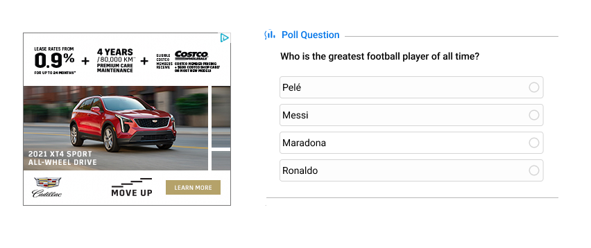
The following are examples of how this product looks in its Default, Featured Comments, and Polls views.

Default View

Featured Comments

Polls
Step 1: Ensure conversations on page
The target element for the call to action button is configurable. It is made that way to allow flexibility on which element the click will take the users to. If you don't have an id for the parent element where the Conversations product is installed in, you will need to set an id for that element.
Here is an example:
<div class="viafoura" id="viafoura-conversations-id">
    <vf-conversations></vf-conversations>
</div>
The element id we are using is: "viafoura-conversations-id". This id needs to be unique on the page.
Step 2: Add the Conversations Starter code to your page
The second step is to define the Engagement Starter tool. As you can see we are using the previously assigned element id as the "target" so that the button behaves correctly.
If you are using article-level container ids, then you will not need to specify your container id in this code:
<div class="viafoura">
    <vf-conversation-starter target="viafoura-conversations-id"></vf-conversation-starter>
</div>
If you are using widget-level container ids, then use this:
<div class="viafoura">
    <vf-conversation-starter vf-container-id="[ENTER UNIQUE ID]" target="viafoura-conversations-id"></vf-conversation-starter>
</div>
In addition to the target parameter, you can configure "title" and "description" parameters:
<div class="viafoura">
  <vf-conversation-starter
        vf-container-id="[ENTER UNIQUE ID]"
        target="viafoura-conversations-id"
        title="Have your say."
        description="Leave a comment below and let us know what you think."
    >
    </vf-conversation-starter>
</div>
About these parameters, let's see more details:
Parameter | Description |
|---|---|
target | Help: Name of the element that the user will be directed to. |
title | Help: Widget title. |
description | Help: Text with description of widget. This is the text below the title. |
minimum-comment-count | Help: Defines the minimum number of comments to show the comment count. |
vf-container-id | Help: The container ID of the current commenting tool. |
If you want to use an ad in the Engagement Starter, you may need to implement using this event, depending on your ad provider: requestConversationStarter
For more details about Ads, please read the Ad Guide.
To improve the user experience, it is highly recommended to use the smooth scroll effect when the user clicks on the target button in order to give the user context to what position on the page they've moved to. In other words, the scroll bar will move slowly with smooth effect.
Define the following CSS snippet:
html {
  scroll-behavior: smooth;
}
It's important to mention that the "scroll-behavior" property must be defined on the element that controls the scroll bar. Usually this element is the root element.
Updated 5 months ago
Learn how to use the Engagement Starter to customize the content and to create polls here:
