Social Share Bar
Feature Deprecation NoticeViafoura will soon be deprecating this version of the Social Share Bar as we will be introducing an updated version that will be fully WCAG AA 2.2 compliant and provide your community with more flexible options.
Introduction
The Article Share Bar allows users to share a specific article to the most popular social media platforms such as Reddit, Facebook or Twitter and even through email. This lightweight tool can be placed above or below your article and pairs with the total share counter.
Step 1: Add the share bar code to your page
This is an example of your starting code snippet. The parameters are customizable.
<div class="viafoura">
    <div class="vf-widget vf-share-bar-default"
    data-widget="sharebar"
    data-button-view="false"
    data-show-labels="false"
    data-show-counters="true"
    data-show-total="true"
    data-path="/">
    </div>
</div>
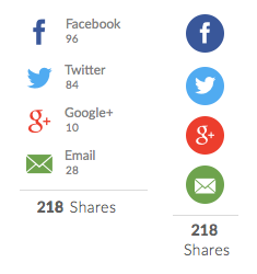
Rendered Example

If you want the share bar or share button to sit inline with other elements on your page, you can add another class to the viafouraparent element that will change its display property to display: inline-block.
.viafoura.inline-block {
    display: inline-block;
}
Step 2: Define custom parameters
| Setting | Description | Accepted Value | Default | Notes |
|---|---|---|---|---|
data-show-total | Show the total share count displayed at the end of the share bar. | true or false | true | This will update in real time when any user interacts with the icons in the share bar. |
data-show-counters | Show the individual share counts for each sharing service. | true or false | true | This will update in real time when any user interacts with the icons in the share bar. |
data-show-labels | Show the name of each sharing service beside the appropriate icon. | true or false | false | This setting applies only if the share bar is vertically oriented (see the list of classes below). |
data-button-view | Display a single button that reveals the share bar as a dropdown menu on hover when viewed on desktop and a fullscreen modal on touch for mobile devices. | true or false | false | |
data-path | The path of the page to be shared. Example: "/example/page.html" | Any string | Path to the current page | e.g. /path/to/article.html |
data-url | The fully-qualified url of the page to be shared. Use either this or data-path. | A fully-qualified url | ||
data-share-current-page-url | If this is | true of false | false | If implementing single-page apps, or infinite scroll, it will be necessary to refresh the sharebar whenever the page URL is updated ( |
NoteThe services displayed in the share bar and the order in which they appear can be configured in your admin settings at https://admin.viafoura.co/.
Step 3: Customize the look and feel
You can apply predetermined styles to the share bar by adding these classes to the vf-widget element. These styles will show when hovering over a chosen icon.
Icon Shape
These classes will affect the shape of the icons in the share bar. You can apply only ONE of these classes to the vf-widget element.
| Class Name | Description | Notes |
|---|---|---|
| vf-share-bar-default | Displays service icons with a transparent background. | If the widget is not given any of the classes listed below, this style will be applied to the icons in the sharebar. By default, an icon's color will reflect the brand color of the sharing service it represents. |
| vf-share-bar-circle | Displays circular icons. | By default, the color of the circle is set to the service's brand color and the logo of the sharing service will be white. |
| vf-share-bar-square | Displays square icons. | By default, the color of the square is set to the service's brand color and the logo of the sharing service will be white. |
NoteBy default, the color of each icon is set to the brand color of the sharing service it represents. You can also apply a predetermined color scheme using any of the classes listed below, or apply your own CSS styles to the share bar icons.
| Class Name | Description | Notes |
|---|---|---|
| vf-share-bar-bw | Applies a black and white theme to the icons in the share bar. | Default Hover Effects: If the widget has the vf-share-bar-default class, the icon color will change to the brand color of the sharing service. If it has either the vf-share-bar-circle or vf-share-bar-square class, the background color will transition to the appropriate brand color while the icon remains white. |
If data-button-view is set to true, which renders the single share button, these classes will apply to the share icons in the dropdown menu (on desktop) or the fullscreen modal (on mobile) that is displayed when users interact with the share button.
Orientation
| Class Name | Description | Notes |
|---|---|---|
| vf-share-bar-vertical | Renders a vertical share bar. | The share bar is horizontally oriented by default. |
If data-button-view is set to true, which renders the single share button, this class will apply to the share icons in the dropdown menu that is displayed when users hover over the share button on desktop.

Borders
| Class Name | Description | Notes |
|---|---|---|
| vf-share-bar-borders | Applies a simple border around the share bar |

Share Button View
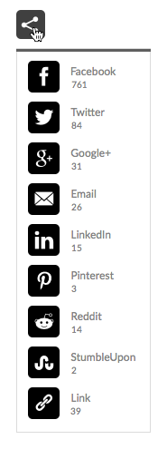
You can display a single share button instead of a full share bar on your page by setting data-button-view = true on the vf-widgetelement. The share bar will appear as a dropdown menu when the user hovers over the share button.
<div class="viafoura">
    <div class="vf-widget vf-share-button-default vf-share-bar-default"
    data-widget="sharebar"
    data-button-view="true"
    data-show-labels="false"
    data-show-counters="true"
    data-show-total="true">
    </div>
 </div>
Rendered Example

Icon Styles: Share Button View

| Class Name | Description | Notes |
|---|---|---|
| vf-share-button-default | Displays a share icon with a transparent background. | If the widget is not given any of the classes below, this style will be applied to the icons in the sharebar. |
| vf-share-button-circle | Displays a circular share icon. | |
| vf-share-button-square | Displays a square share icon. |
The color of the share button icon is set to black by default, but you can override this property using your own CSS styles. Find out more here.
Styling the Icons in the Share Dropdown Menu
You can add any of these classes to the vf-widget element to style the dropdown menu:
| Class Name | Description |
|---|---|
| vf-share-bar-default | Sharing service icons in the dropdown menu will be displayed with a transparent background. |
| vf-share-bar-circle | Renders circular icons in the dropdown menu. |
| vf-share-bar-square | Renders square icons in the dropdown menu. |
| vf-share-bar-bw | Applies the black and white color scheme to the icons in the dropdown menu. |
| vf-share-bar-vertical | Renders a vertical dropdown menu. |
If none of these classes are added to the vf-widget element, and data-button-view = true, the icons in the dropdown menu will inherit the shape of the share button.
Show/Hide Share Counts: Share Button View
| Setting | Description | Accepted Values | Default | Notes |
|---|---|---|---|---|
| data-show-total | Displays the total share count beside the share button. | true or false | true | The total share count is not displayed in the dropdown menu. |
| data-show-counters | Show the individual share counts for each sharing service in the dropdown menu. | true or false | true |
Desktop and Mobile Behaviors: Share bar
The sharebar detects mobile users based on user-agent and displays a slightly different interface for them. The rational for this approach to mobile detection is that we can never know what responsive breakpoints a client might. Therefore we make no attempt to try to force clients into a specific page width that should be considered "mobile".
Horizontal Share bar
| Device | Behaviour |
|---|---|
| Desktop | All icons and counters are visible. |
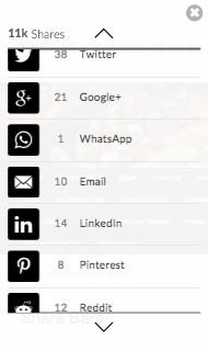
| Smartphone (Viewport width less than 765px) | If the viewport width is less than 765px, the share bar is shortened to the first three sharing services. If the share bar contains more than three sharing services, a "show more" button will be appended to the shortened share bar. On touch, this button will open a fullscreen modal with a translucent background in which the share bar is rendered as a vertical scrolling menu displaying the individual share counts, the total share count, and labels for each sharing service. |
Shortened Share Bar

Fullscreen Modal

Share Button
| Device | Behaviour |
|---|---|
| Desktop | Hover over the share button to display the share bar as a dropdown menu. |
| Smartphone and Tablet | On touch, the button opens a fullscreen modal with a translucent background in which the share bar is rendered as a vertical scrolling menu displaying the individual share counts, the total share count, and labels for each sharing service. |
Desktop Rendered Image

Mobile Rendered Image

Link Sharing Service
| Device | Behaviour |
|---|---|
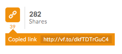
| Desktop (if Flash is enabled) | When the link icon is clicked, a tooltip appears notifying the user that the link to the current page has been copied to their clipboard. |
| Desktop (if Flash is unavailable) | When the link icon is clicked, a small modal appears on screen with a text field from which users can manually copy the link to the current page. |
| Smartphone and Tablet | If the link icon is one of the three sharing services that are displayed in the shortened sharebar, it will open the fullscreen modal on touch. In the modal, the link icon is displayed beside a text field on which users can apply a long tap to manually copy the link to the current page. |
Desktop Image Rendered (if Flash is enabled)

Desktop Image Rendered (if Flash is unavailable)

Smartphone and Tablet

Switch to Button View on Window Size
Because on desktop there are only full views and button views, it may sometimes be useful to render the button view on small window sizes. To allow clients the most flexibility, we have not made any decisions for you on this integration. Instead we suggest adding a function to dynamically determine which display to use such as the following (assumes jQuery):
<script>
        window.vfAsyncInit = function(){
            // Do the resize
            function doResize(e) {
                var limit = 500; // Width in pixels at which to switch to button view
                var windowSize = $(window).width();
                var myShareWidget = $('#myShareWidget');
                var isButton = myShareWidget.attr('data-button-view');
                isButton = !!(isButton && isButton.trim() === "true");

                // This is the important logic that triggers the change to button
                // view and re-render
                if (windowSize <= limit && !isButton) {
                    myShareWidget.attr('data-button-view', "true");
                    viafoura.reset();
                }
                else if (windowSize > limit && isButton) {
                    myShareWidget.attr('data-button-view', "false");
                    viafoura.reset();
                }
            }

            // Call once on first page load
            doResize();

            var timeoutId;
            $(window).on('resize', function(e) {
                // Debounce the function
                clearTimeout(timeoutId);
                timeoutId = setTimeout(function() {
                    doResize(e);
                    timeoutId = undefined;
                }, 250);
            });
        };
    </script>
Updated 8 months ago
