
Component Colours
NoteThe following documentation for custom colour overrides apply to Community Chats, Live Blogs, Live Q&A, and the latest version of Conversations.
CSS colour variables are not supported by older browsers such as IE11.
Viafoura supports CSS variables that can be used to override Viafoura's colour palettes in a predictable manner.
The CSS colour variables have been designed to separate functional colour names and designate the relevant text colours that are intended to be paired with a given background colour.
Basic Usage
The CSS variables can be defined in the Viafoura CSS namespace, or targeting something more specific such as the wrapper component for your viafoura widget.
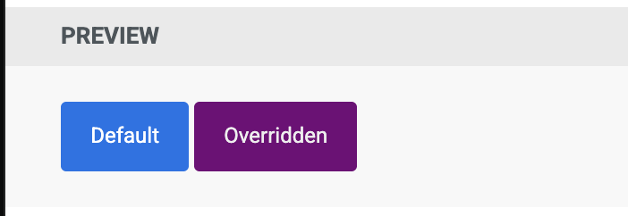
#my-comments .viafoura {
    --accent-color-light: #7600c9;
    --accent-color: #540157;
    --accent-color-dark: #360138;
    --text-on-accent-color: #eeeeee;
}
Colour Palettes
Viafoura provides a variety of colour palettes. In general all colours have at least a dark, regular, and light version. Some colours also provide additional levels of lightness named by their opacity percentage. So accent-color-10 is the accent colour at 10% opacity.
Accent Color
| Token | Value | Color |
|---|---|---|
--accent-color-dark | #004e9c |  |
--accent-color-semi-dark | #0062c4 |  |
--accent-color | #0074e8 |  |
--accent-color-light | #007fff |  |
--accent-color-90 | 90% #0074e8 |  |
--accent-color-10 | 10% #0074e8 |  |
--accent-color-05 | 5% #0074e8 |  |
Error Color
| Token | Value | Color |
|---|---|---|
--error-color-dark | #752121 |  |
--error-color-semi-dark | #a33a3a |  |
--error-color | #cc4949 |  |
--error-color-light | #d77171 |  |
--error-color-20 | 20% #cc4949 |  |
--error-color-05 | 5% #cc4949 |  |
--error-color-0 | 0% #cc4949 |  |
Mention Color
| Token | Value | Color |
|---|---|---|
--mention-color-dark | #0d5948 |  |
--mention-color | #14856c |  |
--mention-color-light | #1cbb98 |  |
Success Color
| Token | Value | Color |
|---|---|---|
--success-color-dark | #28570b |  |
--success-color-semi-dark | #2e630c |  |
--success-color | #3d8510 |  |
--success-color-light | #63ac14 |  |
Default Background Colors - Deprecated
| Token | Value | Color |
|---|---|---|
--default-color | #ffffff |  |
--default-color-60 | 60% #ffffff |  |
--default-color-30 | 30% #ffffff |  |
--default-color-0 | 0% #ffffff |  |
Warning Color
| Token | Value | Color |
|---|---|---|
--warning-color-dark | #7c3600 |  |
--warning-color-semi-dark | #964100 |  |
--warning-color | #b95000 |  |
--warning-color-light | #ff8f39 |  |
Editor's Pick Color
| Token | Value | Color |
|---|---|---|
--editors-pick-color | #6d0483 |  |
Highlight Color
| Token | Value | Color |
|---|---|---|
--highlight-color | #ffc100 |  |
--highlight-color-semi-dark | #C59E00 |  |
--highlight-color-10 | 10% #ffc100 |  |
Primary Colors
| Token | Value | Color |
|---|---|---|
--primary-color-100 | #000000 |  |
--primary-color-75 | 75% #000000 |  |
--primary-color-60 | 60% #000000 |  |
--primary-color-30 | 30% #000000 |  |
--primary-color-20 | 20% #000000 |  |
--primary-color-15 | 15% #000000 |  |
--primary-color-10 | 10% #000000 |  |
--primary-color-04 | 4% #000000 |  |
--primary-color-02 | 2% #000000 |  |
Text Colours
A specific set of colour combinations have been defined to ensure readability of text and that all text and background color combinations meet at least WCAG AA guidelines for colour contrast.
Some baseline rules:
- Any unsuffixed colour name or one suffixed with -dark can be used on --default-colour (so, --accent-color or --accent-color-dark could appear as text on a --default-color background, but --accent-color-light could not)
- Any unsuffixed, dark, or light colour name can be used for iconography that might replace text (eg: --mention-color-dark, or --mention-color, or --mention-color-light)
- All colours provide a related text colour name that can be used eg: --text-on-mention-color
Text Colours
| Token | Value | Color |
|---|---|---|
--dark-text-on-default-color | #000000 |  |
--light-text-on-default-color | 60% #000000 |  |
--text-on-accent-color | #ffffff |  |
--text-on-mention-color | #ffffff |  |
--text-on-success-color | #ffffff |  |
--text-on-error-color | #ffffff |  |
--text-on-warning-color | #ffffff |  |
Custom CSS Classes
Custom CSS Classes
Viafoura provides custom CSS classes that can be used to customize styles of specific custom badges.
By default, Viafoura Custom Badges inherit the accent-color as defined by Viafoura's colour palettes or your CSS variables To override the color you can use the following CSS class.
/* Replace {label} with your custom badge's unique label */
.viafoura .vf-badge.vf-custom-badge--{label} {
    background-color: #540157;
}
In the case where you have a created a custom badge labelled expert, the class would be defined as follows.
.viafoura .vf-badge.vf-custom-badge--expert {
    background-color: #540157;
}
Updated about 2 months ago